Originally posted at http://fx.worth1000.com/tutorials/160998/how-to-do-spider-doo
This tutorial is just a guide. I want you to use a different set of images then the creator made. Use the one of the images below and the tutorial as a guide.


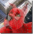
And use one of these Spiderman images as a base.


The tools and techniques we're going to cover are all very basic. With that in mind, I'm trying to write this for the beginner PSer. There will be lots of images showing the step-by-step progression, and I'll include particularly helpful keyboard shortcuts in parentheses where I can.
Please read the other tutorials. They are all excellent. For masking help, see arsi's "Merging" and Ironkite's "Dig" tutorials, and for coloring tips, refer to steveo's "Colorization" tutorial.
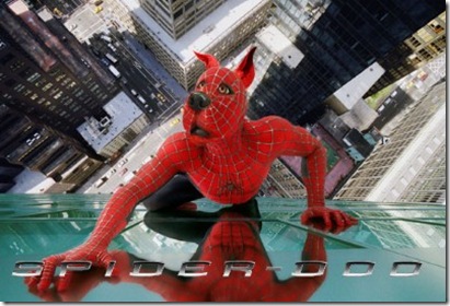
We are going to make something like this, but better.

Choose 1 Spiderman image and 1 Scooby-Doo image from above; try to use images that will go together..

If you think our existing layers are going to be a distraction, you can hide the layer off by clicking the eyeball to the left of it in the layers window.
CUTTING OUT SCOOBY.

In a new window, open the Scooby image you are working with. Crop it so you are revealing just the head and neck, basically anything you will need and a little bit more. Scooby is shown, but since we're only using his head, let's again use the crop tool to draw a box around his head.

Zoom in close and carefully cut out his head. Now use the move tool and drag and drop Scooby onto the Spider-man image. OR copy and past the layer.
Because the Scooby source might be a deferent resolution than the Spider-man source, Scooby's head needs to be resized. Select Hit ctrl-t to activate the free transform tool. Grab a corner and hold down shift to constrain proportions as you bring the corner in. Don't worry about making it *exactly* the same size as Spider-man's head at this point.

*Take a second to look at the two heads side by side. Be aware of the light source, it should be on the same side. If it is on the wrong side you can always choose Transform –> Flip Horizontally.
We lucked out. They are turned at very similar angles and the lighting is not that strong, which is going to make this a lot easier to pull off. There will be some minor angle tweaking and resizing later to make it more convincing.
Now we have to place and scale Scooby Doos’s head, aligning it with Spiderman’s. Using the transform tool, {CTRL T"} rotate, scale and position Scooby’s head and align it the best you can.
Cut off the neck.
We could use the eraser here, but instead we're going to create a layer mask. Why a mask?
The eraser can be imprecise and if you remove a few pixels you later want to get back, you can't, at least not without undoing all the work you've done. Basically, it is an eraser tool with a simple undo. The layer mask is going to produce better results, so if you haven't tried using layer masks yet, you should start. Don't worry, it's easy.
The eraser can be imprecise and if you remove a few pixels you later want to get back, you can't, at least not without undoing all the work you've done. Basically, it is an eraser tool with a simple undo. The layer mask is going to produce better results, so if you haven't tried using layer masks yet, you should start. Don't worry, it's easy.
Since we basically have Scooby’s head already cut out, we can just {CTRL Left Click} on the layer, which will select everything in the layer. With your Scooby layer active in the layers window, click the "add layer mask" button at the bottom left, second one in:

This will create a mask around everything except the area you have selected. Think of it as a stencil and the white area is the visible area . Select your paintbrush tool (key b). Limit your colors to black and white, which they should be set to by default since you are in layer mask mode. Paint with black, and you can see the layer below. Paint with white over a masked area, and you bring back the pixels you had masked out. It's that easy. You could mess with using shades of gray, so let's keep it simple. Paint with black around Scooby's neck depending how much is revealed. Make sure in the layers window that the mask layer is active, and that your brush mode is set to normal and at 100% opacity. Use (key x) to toggle between black and white.
This will create a mask around everything except the area you have selected. Think of it as a stencil and the white area is the visible area . Select your paintbrush tool (key b). Limit your colors to black and white, which they should be set to by default since you are in layer mask mode. Paint with black, and you can see the layer below. Paint with white over a masked area, and you bring back the pixels you had masked out. It's that easy. You could mess with using shades of gray, so let's keep it simple. Paint with black around Scooby's neck depending how much is revealed. Make sure in the layers window that the mask layer is active, and that your brush mode is set to normal and at 100% opacity. Use (key x) to toggle between black and white.

With a black brush with a soft edge, carefully paint out his neck.
Notice that Spiderman’s head shows through in the background and we need to fix that. With the rectangular marquee tool select and area like below. 
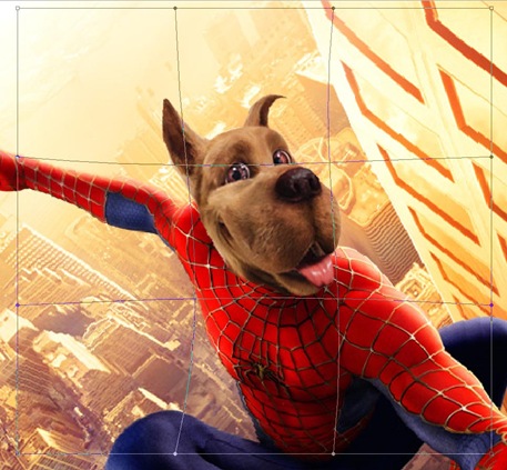
With the background layer selected, copy and paste this image. It will create a new layer. We will now deform this layer with the Warp Tool to hide Spiderman’s head behind Scooby Doo’s. Select this layer, and choose Edit > Transform > Warp. A lattice will appear and you can move the center points around to shrink his head. Be careful not to change the perimeter because then it will not align with the rest of the picture. Look the border is still fixed, but the center is deformed.
It should look something like this.
Before we change the color of Scooby’s head, we need to apply the layer mask. Right click on the B&W layer mask and choose Apply Layer Mask.
Change Scooby’s Color:
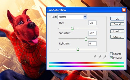
Select just Scooby’s head again. CTRL + Left Click on the layer’s image. With it still selected, press the Ying & Yang looking icon next to the create mask icon. Look below. Choose Hue/Saturation.
Adjust the Hue and the Saturation until the color is close.
Since we applied the hue/saturation to the whole head, his eyes, tongue,and nose changes color too. Paint out everything that you do not want to be red with the black paint brush. Make sure you paint in the mask layer.
Select your paintbrush tool (key b). Paint with black, and you can see the layer below. Paint with white over a masked area, and you bring back the pixels you had masked out. It's that easy. Make sure in the layers window that the mask layer is active, and that your brush mode is set to normal and at 100% opacity. Use (key x) to toggle between black and white.
If the over all color is still a bit off, you can further finesse it with the color. I just added 22 units of yellow or –22 on the RGB Color Level input. I think I nailed it.

Now we're getting somewhere. Use the move tool to place Scooby's face over Spider-man's face. If we reduce the opacity of the Scooby layer to 50%, we can see just how the two faces match up.
Selecting the original Spider-man layer, with the marquee selection tool draw a box around Spider-man’s head. Making sure you are in the correct layer, copy and then paste the head.
Rebuilding the facial webbing.

Notice that the curve at the top of Scooby's head matches quite nicely with the curve of Spider-man's head. Also the outline of the inside of Scooby's left (our right) eye is along the same angle as the one line of the webbing on Spider-man's face. These are going to be the two points where we will focus when we determine the final placement of the scooby layer.
First, we need to get the size and angle right. Use the transform tool (ctrl-t) to shrink Scooby's head a little more if necessary. With the transform tool still active, rotate Scooby's head a little bit counter-clockwise, paying close attention to the alignment of the eye and the top of the head.

Now it's time to get some of that web pattern from Spider-man onto Scooby's face. In the layers window, click on the mask on the scooby layer. Select the paintbrush and make sure it is in normal mode and at 100% opacity. If you paint with black, you will reveal the Spider-man layer below, and the webbing appears to be on Scooby's face now. Play with the layer opacity settings in the layers window as you do this, bringing it up to 100% to see the full effect, and working at a lower opacity to paint the mask. I found an opacity setting of 70% about right for the painting part.
Don't paint all the way up to the mouth and nose, but go ahead and get right up to the eyes. At this point, you might realize that Scooby's right (our left) eye also comes close to matching up with a line of the webbing. So let's mask that part out as well. Right now, the face should look something like this:

Now switch the brush opacity to 35% and mask out the rest of the area beneath the nose and around the mouth. The webbing is very white here, but by retaining some of the red in the scooby layer, we manage to tone it down.

Now take a moment to appreciate how lucky we are. Scooby's right eye and his nose cover Spidey's one big white eye almost completely. Unfortunately, that other, even larger, big white eye needs to be taken care of. Let's take care of it then.
This is going to be a bit of a chore, but stick with me. We're almost done.
Turn up the opacity on the scooby layer to 100% and then click the eyeball icon to the left in the layers window to make it disappear. Activate the spider-man layer by clicking on it.
Use the polygonal lasso tool (key l, shift-l to scroll through the different lassos) to select portions from other parts of Spider-man's face that can be used to cover the eye. This isn't going to work for the entire eye, but for now we can cover part of it this way. When you have selected an area, use the move tool and alt-option drag the selection where you want it. Use the transform tool to rotate it into place.

I could only get this to work convincingly along the edges of the eye. We're going to have to take the middle and fill it with some red, and then add the webbing later.
The method is the same, but this time use the lasso to select an entirely red area with no webbing. Use the alt-option move technique to copy the selected area over the white of the eye. If the area you selected is smaller than the white area, then drop and alt-option move the selection a few times to fill the space. You'll probably have to use the transform tool to manipulate your selection to the right size to fit the white space.
If you click the eyeball next to the scooby layer, what you have should look like this:

Same method on recreating the webbing. If you haven't been zooming in yet, at this point you will have to. I went in as far as 900% to finish the webbing. (remember the spacebar tip for maneuvering).
Keep the scooby layer visible but click back to the spider-man layer. Select parts of the webbing that aren't too white and match up well with the surrounding webbing. Use the transform tool to rotate your selection and skew/stretch/etc to fit the area. Don't stretch too much, or it will look blurry. Use the same alt-option move method from before.

Once you have all the web-lines where you want them, there's just one small hurdle to leap and a few finishing touches, and then the finish line!
That one area of his face needs some web. We can't mask it there, because the layer beneath his jowl is a city street.
Time for that polygonal lasso again. But first we need to make a copy of the spider-man layer. In the layers window, drag the spider-man layer to the "create new layer" button. It's the same one we used to make the gray layer earlier.
Rename this layer "cheek" or "jowl", and select a region of his cheek larger than the area where we want to place it. Don't worry about shaping it to fit the jowl, we'll do that later. Just try to find a curve in the webbing that might match up on the other side of his face. Use the lines of his barely discernable whiskers as your target.
Once you have your selection done, invert it by hitting ctrl-shift-i. Hit the delete key and all you have left is this little bit of cheek area. Hit ctrl-d to deselect since the cheek is the only part of the layer now. Move this layer in the layer window to the top, and reduce it to 80%. I flipped it horizontally by going to Edit>Transform>Flip horizontal, but you might not have to do that.
Move this layer over Scooby's jowl, and create a layer mask like we did earlier to remove the unneeded parts. Make sure your paintbrush is at 100% opacity, normal blend setting. Paint with black over the area you want to hide. It might help to toy with the layer opacity setting to get it right. Your layers window should look like this:

Let's put this baby to bed.
If you are a little compulsive like I am, you're going to want to fix some of those web lines. I did it by zooming in way too far and copy-pasting single pixels on the spider-man layer to define the lines a little better and make them less blurry. More than a bit tiresome.
There are easier fixes. That little smidge of Spidey's right eye (our left) has to go. With the spider-man layer active, use the clone stamp (key s) to replace that offensive bit of white that is showing. Select pixels from the street to cover it.
I used a filter to get the highlight on the nose, but this is such an afterthought you might not want to bother. However, it helps in making the ears match up color-wise if you put a little shadow on them. I'll show you how I used it on the cheek layer, and the settings were similar on the rest of the layers, but I only got there through experimentation. Go to Filter>Render>Lighting Effects and the following menu will appear. As you see it, it is set to the settings I used on the cheek layer:

Alright. I also added some more color to the ears. That red wasn't quite right, so if you are playing along, switch your brush opacity to 40% change the setting to overlay, and find a red that matches a little too well, and paint those ears.
Looks like we're done. Let's make the title layer visible by clicking the eyeball icon next to it and ask the question: How did we do?
Original:

And here's the one I just made for the tutorial:

They look awfully close if you ask me. Yeehaw.


I hate this stupid thing!!!!
ReplyDeleteWhat is this dennnyyyyyyyys
ReplyDeleteEEAZZZZZZZZZZZY NOW ZEEEEEEEEEEEEEEEEEEEESHANNNNNNNNNNNY
ReplyDelete